Difference Plot
Region availability: Melbourne, Metropolitan Melbourne
This app allows you to draw a difference plot to compare volume and speed between two different times.
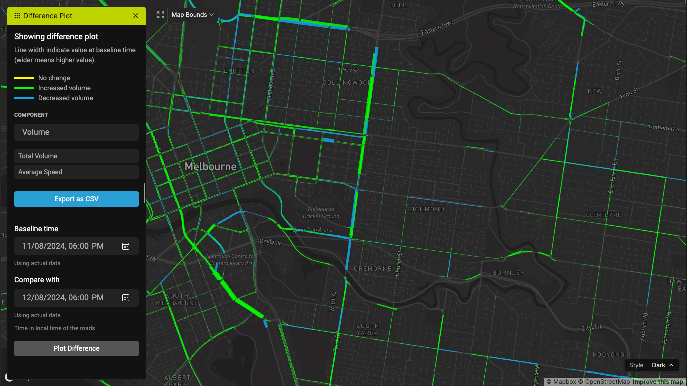
Select the "Baseline" and "Compare with" times, and click on "Plot Difference". This will take quite some time to complete.
Once the result is out, there will be an option to export the data as CSV.
Interpreting the difference plot
The width of the lines represent the "Baseline" values; the wider it is, the bigger it is.
The color if the lines indicate the change in value: blue means negative change, green means positive change, and yellow means insignificant change.