Using Query
Query is a powerful tool that allows you to create a custom query to visualise and export data on the platform. You can filter, sort, aggregate, and join static and time series data in a visual and intuitive way. Use the "Query" menu on the top navbar to use this feature.
This page will cover how you could build a query and visualise/export the data.
The query builder
Upon opening the Query page, you will see the query builder, as seen below.
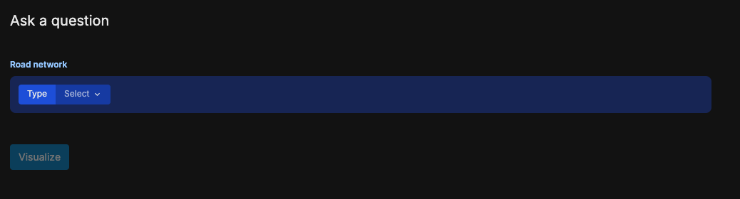
The query is divided into blocks. Think of block as a function, where the output of a block is piped as an input to the next block. The first block of a query is always the "Road Network" block.
Road Network block
In this block, you define the data source for the query. Currently, there are only two types of data sources, which will have different set of attributes.
- Road (also known as Link)
- Intersection
Type
First, select the Type using the dropdown. Then, two more select fields will appear, namely "Selection" and "Attributes".
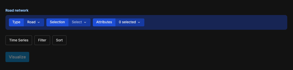
Selection
Using the "Selection" option, you can choose to either use the area of the road network. Choose either:
-
Entire network - This will include data from the entire road network region
-
List roads/intersections - You can specify the Link/Intersection IDs
-
Polygon - You can use this to draw an arbitrary polygon. For example, if you only want to export the data of roads within Melbourne Free Tram Zone, you can draw a polygon around the Free Tram Zone only.
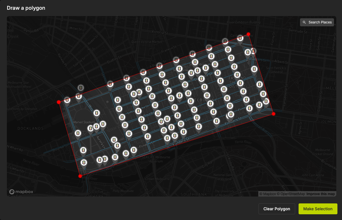
Click on "Make Selection" to finish drawing the polygon. If you need to jump to a particular address, use the "Search Places" button on the top-right corner.
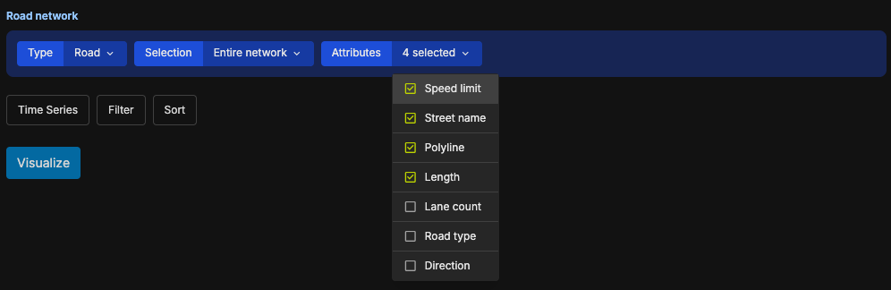
Attributes
Finally, you can select which attributes to include in the query. Only checked attributes will be made available for the next blocks.
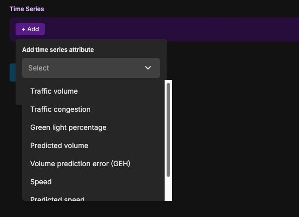
Time Series block
If you need to visualise time series data (which you almost certainly would), you can use the Time Series block to add time series data into your query. Click on the "Add" button to choose a time series data.
The attributes you can choose depend on the road network type. You can choose more than one.
Filter block
You can use the filter block to narrow things down based on certain criteria. The attributes you have selected in the Road Network and Time Series blocks will appear here.
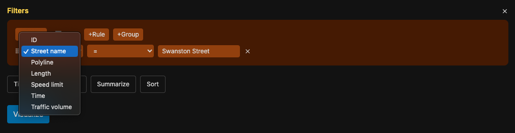
You can create complex nested filtering logic using this block.
Sort block
You can use the sort block to order data based on the attributes values.
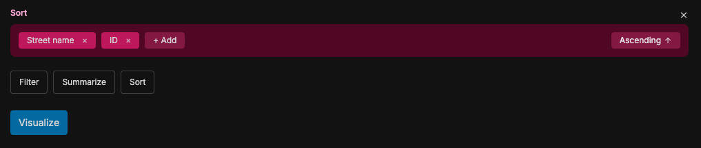
First, you need to add which attributes the sorting is based on. You can select more than one. Then, you can select the sorting order (ascending or descending) using the toggle on the right side.
Summarize block
You can group and aggregate data using the summarize block.
When we have a query like "what is the average speed of each street today", we're asking for a summary of the data. A summary consists of three parts, the numbers we care about (known as metrics), how we would like to group those numbers (known as aggregation function), and based on what attributes.
For example, for the above query "what is the average speed of each street today":
- The metric would be the speed.
- We want to take the average of the speed. Meaning, average is the aggregation function.
- We want to group that metric by each "street".
This is what the query will look like:
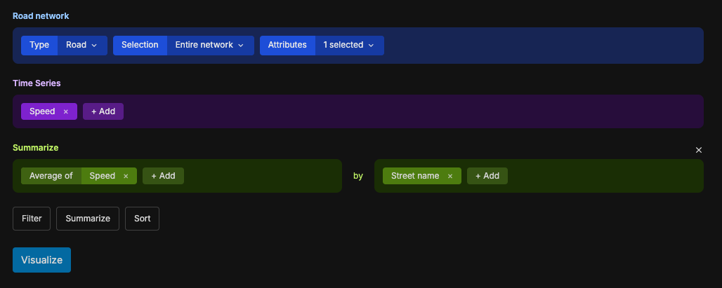
The above is just an example. You can choose other attributes and aggregation functions in the summarize block. You can choose, for example, "Sum of Traffic Volume by 15-minute Period".
Running and visualising the query
Once you have built your query, the next step is to start running and visualising it. Click on the "Visualize" button to do so. You then will see the Data Explorer page.
Depending on the complexity of the query, it may take a while.
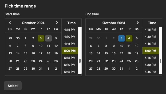
Setting the time window
Use the time selector in the top-right corner to select the date range. You can choose one of the preset ones, or use the "Custom range" option to choose an arbitrary date and time.
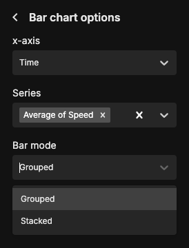
Configuring the plot
The platform does not define the default visualisation method.
Thus, when the query finished running, you will see a message like this: Visualization not configured properly
You can configure the plot using the left pane of the Data Explorer.
First, choose one plot type from the options. Once you clicked it, you will see an option to set the attributes for x-axis, y-axis, and other plot-specific options.
The plot will re-load and display the visualisation.
Viewing the data as a table
At the bottom of the page, you will see a toggle to switch between "table" and "plot" view. Click on the Table View (left) to view the data table.

Exporting as CSV
On the bottom right corner, you will see an Export CSV button. Click to export the data as CSV.